Author: Karl Barndt

  • Do Mobile Users Require Different Content?

    Do Mobile Users Require Different Content?

    My previous post discussed the need for website and email design better suited for viewing on mobile devices–as anyone who has tried to view a non-mobile-optimized website on a smartphone understands.

    Responsive design is one of the easiest ways to adjust a website’s layout and fonts to fit the size of the screen being viewed. Likewise, many email marketing platforms now offer responsive design capabilities and templates.

    But is this enough? Or do we need to consider how mobile users consume content while on their devices?

    Speaking for myself, my browsing habits while parked in front of my 24″ flatscreen monitor are far more leisurely than when I’m hunting up a product review on my smartphone in a crowded store.

    Unless I’m surfing my phone to kill time (while waiting in the airport for a flight, for example), I prefer to get to the information I want quickly and with as little futzing around as possible.

    The Shopping Experience on Mobile Versus Desktop

    Amazon is a good example of what I’m talking about.

    On the desktop, your basic Amazon product page is packed with content. Some relates to the product being viewed, like descriptions and reviews, while much of it is tied to related products, promotions, and account info.

    Amazon Desktop and Mobile Product Page

    But view the same product on your smartphone and the experience is completely different. Gone are all the distractions. Sections of the product listing, like description and features, are truncated, with the option for the shopper to view the full info with a click.

    I see this approach to serving up different versions of content to mobile users becoming quite common as our content publishing platforms grow more sophisticated and methods to accurately identify mobile devices improve. But it’s also going to require more testing and a deeper understanding of how mobile users consume content and respond to calls to action.

    The Landing Page Must Change for Mobile

    Perhaps landing pages (also called offer pages) provide the most relevant example for inbound marketers of the need to serve up alternate or optimized mobile content. Building a landing page for a desktop screen is fairly straightforward. You’ve got a headline, a short block of copy, benefit bullet points, a relevant graphic, maybe a short video, and a lead capture form.

    Below, to the left, is a typical landing page on a desktop or laptop screen. To the right is the same page as viewed on a smartphone. The mobile version was created using responsive design technology, but was not optimized specifically for a mobile device.

    Landing/Offer Page on Desktop and Mobile

    Notice how the mobile version requires quite a bit of scrolling and is hard to follow when compared to the desktop version? I don’t have the data, but I would guess that the mobile version also converts poorly against the desktop version.

    This is a good example of a key issue that marketers must grapple with as mobile continues to become the preferred method of accessing online content.

    Customizing Email for Mobile

    Let’s consider email on the desktop and on a mobile device like your smartphone.

    If a subscriber receives your email and opens it on the desktop or laptop PC, they will see not only a layout optimized for a large screen, but they may have longer paragraphs and more of them, plus additional graphics.

    However, if they open the email on a smartphone, the email might contain a different set of text and graphic content, organized in a simpler layout. The text will likely be shorter and written for fast and easy reading on a small screen. Graphics may be different than those in the large-screen version; they will not only be smaller in size, but may be simpler in composition.

    Lots of Change Coming Very Soon

    And that’s only the tip of the iceberg. As marketers, we must learn how prospects behave while using mobile devices versus desktops. We must test, adapt, and test some more. We must push our technology providers to give us the features and capabilities we’ll need to improve our marketing efforts to mobile users.

    I wish I had an easy solution for how to deal with content optimization among desktop and mobile devices, but I don’t. Many of our content delivery platforms have yet to provide the technology to optimize for specific devices. The growth of mobile has been so rapid that it’s caught most of us with our pants down.

    But we’re learning, and I think we’ll see more solutions in 2014.

    If you want to dig deeper into the state of mobile internet access today and how we might adapt our content strategies, then I encourage you to visit Karen McGrane’s blog. Karen is the author of Content Strategy for Mobile, an ebook outlining her thoughts and research on this very subject, with her recommendations about how content management systems can be modified to serve “packaged” content to specific platforms.

    The third and final part of the blog series on mobile will look at some practical solutions you can employ immediately, using readily available tools.

  • Mobile Marketing Is No Longer Optional

    Mobile Marketing Is No Longer Optional

    A few days ago, Movable Ink posted their US Consumer Device Preference Report for Q3 2013,  showing that 61% of email opens occurred on a mobile device like a phone or tablet. That’s more people opening emails on mobile devices than desktops (“desktop” referring to both desktop PCs and laptops.

    And the Pew Research Center reported in September 2013 that 21% of adult cellular device owners do most of their online browsing via a smart phone. You can view the full report here.

    Mobile users require a different viewing and interactive experience than do desktop users. At the very least, they need to be able to view and navigate content easily. The days of being faced with microscopic type, unwieldy layouts and broken navigation are over for businesses that want to stay competitive. Mobile marketing is here for everyone.

    This means a change in how marketers serve up web and email content to their prospects and clients.

    Only a few years ago, being “mobile-friendly” meant having two websites: one built for desktops and one for mobile devices. You might have identified mobile websites by their URLs having an “m.” as a prefix to the regular URL. Browse eBay with your smartphone and you’ll see m.ebay.com for the URL.

    Simpler websites would have their “m.” sites designed and maintained separately from the main site. You could imagine the pain that would be. More sophisticated sites (like eBay) would dynamically generate the mobile version from a database engine.

    But the fun doesn’t stop there. HubSpot has a detailed blog post describing the SEO problems multi-URL sites can have. Recommended reading if you fall into this camp.

    And then came responsive design…

    Responsive Design is a Good Start

    There’s plenty of discussion about responsive design for websites and email in the popular Inbound Marketing channels.

    Responsive design often uses a combination of meta tags and CSS to deliver content in a layout suitable for the device or media being used. Fonts are larger; menus and links are simplified and optimized for touch; complex, multi-column layouts are reduced to single columns; large graphics are replaced with smaller and/or simpler graphics suitable for the screen size being viewed.

    A responsive website should also strive for faster load times on mobile devices. Again, this means optimizing the layout and graphics to reduce bandwidth demands (smaller images and less complex layouts).

    Here’s a recent blog post of mine displayed on a Samsung Galaxy S3 phone, a Nook 8.9″ Android tablet, and a laptop screen:

    Samsung Galaxy S3 screen
    Samsung Galaxy S3 screen
    Nook Etika Screenshot
    Nook HD 8.9″ Android tablet screen
    Laptop PC screen
    Laptop PC screen

    HubSpot has a very handy tool to simulate how your website looks on various mobile devices. It even lets you navigate your website on the simulations. Very cool stuff. You can find it here.

    My WordPress site (the one you’re reading right now) happens to use a responsive theme that relies on CSS for the mobile-friendly features. A “media query” in the HTML header or in the CSS determines the screen size (usually width) of device you’re using to view the site, then sets style parameters or loads an appropriate stylesheet.

    Here’s an example of an HTML header tag to load a special mobile-optimized stylesheet in the event a small screen is detected:

    <link rel="stylesheet" type="text/css" media="only screen and (max-device-width: 500px)" href="small-phone.css" />

    Other WordPress websites might use similar themes and CSS for responsiveness or they might use a combination of theme/CSS and a mobile plugin or just a mobile plugin with a non-responsive theme. There are pros and cons with each of these options.

    And Don’t Forget Email

    But responsive design isn’t limited to websites. In fact, email might be a more critical application of responsive design, especially since the number of people viewing email on mobile devices is rapidly overtaking desktop use. Simple responsive email designs work much like responsive websites do, by changing font sizes and simplifying layouts into single columns. Here’s an example of an email newsletter using a responsive design:

    email example browser
    Email on a desktop browser
    email example mobile
    Email on a phone

    However, some email marketing platforms allow email designers to create completely different emails for mobile users. Chad White, Principal of Marketing Research at ExactTarget and author of the book Email Marketing Rules, writes about how some businesses are making email content mobile-friendly on the Content Marketing Institute’s blog.

    He talks about responsive design, where the layout alters to accommodate smaller mobile screens, but he then gets into “mobile-targeted” design, where elements of the email content are changed to accommodate mobile users. These elements might include mobile-specific offers (“show this coupon to the cashier for an extra 10% off”) and call-to-action buttons (“click to call now”).

    But, before we can create this alternate email content, we must understand how mobile users consume content on their devices. It’s a new dimension to marketing, but one we can’t ignore.

    Next week, in Part 2 of this post, I’m going to explore the possibilities of how marketers might go beyond responsive design. How does “responsive content” sound?

  • How and Why to Hide Your PDF Content from Search Engines

    How and Why to Hide Your PDF Content from Search Engines

    This blog post is the result of a recent discussion started on the LinkedIn HubSpot Partners Group about PDF files and duplicate blog content penalties. (Note: This group is a closed group, so you won’t be able to view the discussion if you’re not a member, sorry.)

    I made a few suggestions in the LinkedIn discussion about hiding PDFs from search engines, but I realized that this topic required a much longer treatment to be useful. For this blog post I’m going to focus on using PDFs in an inbound marketing website. But my suggestions are also applicable for most business websites.

    Here are some examples of PDF content you might offer on your website:

    • Your own premium content, like ebooks, tip sheets or whitepapers for lead generation purposes.
    • Content intended for printing, like worksheets, maps, how-to lists, mind maps, etc.
    • Marketing collateral intended for downloading, printing, or redistribution, including brochures, data sheets, spec sheets, etc.
    • Content from other sources that you are redistributing (with permission, of course), like articles, whitepapers, ebooks, etc.

    In my opinion, the two biggest reasons why Inbound Marketers should consider hiding their PDF content form search engines are the duplicate content penalty and loss of leads.

    Avoid the Duplicate Content Penalty

    The duplicate content penalty is quite simple, so let’s get it out of the way now. Google and other search engines penalize websites that use the same content in different places on the same website.

    Say you collect a number of related blog posts into an ebook PDF file and use that as a premium for lead generation. If the search engines robots can find that PDF, they will index all the text inside the ebook. Now, when the search engine sees those same portions of content in the old blog posts, it will flag those posts (or the PDF file) as duplicate content.

    The easy solution is to make sure the search engines can’t find or read the PDFs. Duplicate content problem solved.

    Protect Your Lead Generation Machine

    As Inbound Marketers, you’re goal is to attract visitors to your website with quality relevant content and convert them into leads via an appealing offer. In many cases this offer is a piece of downloadable premium content, like a PDF file. The visitor completes a short form on a landing page to gain access to the PDF file.

    It’s a basic lead generation technique, but it only works if the visitor completes the landing page form. If they can find your PDF offering directly through a web search, then they’ll likely view only the PDF file itself.

    Even worse, by opening or downloading your PDF directly, they might never see your website and its accompanying navigation. They only see your PDF file, nothing else. All your hard work creating an accessible and useful website is wasted. And forget capturing their information or plugging them your marketing funnel. Not likely to happen. You’ve missed your chance.

    Some marketers try to compensate by placing their website URL in the header or footer of their PDF, hoping that the curious reader clicks the link and visits.

    Don’t count on it.

    Be ruthless in forcing your visitors though your landing pages and opt-in forms. And the only way to enforce these opt-ins is to hide your PDF content from the search engines.

    Fortunately, it’s not hard to hide PDFs and other files from compliant search engines like Google, Bing, Yahoo, etc.

    The Right Way to Upload Files and Hide Them

    First, upload your PDF to your website. In HubSpot’s COS you would follow the instructions provided here.

    For other websites not using the HubSpot COS, you need to upload your file to a directory. You can create a unique directory for that PDF or you can have a directory that holds all of your PDF files and other downloads. If you choose to have a single download directory for all of your downloadable files, then make sure you protect it with an index file that prevents visitors from viewing a directory listing. If your website is installed on an Apache server, then you can add this simple line to the beginning of your .htaccess file:

    Options -Indexes

    This will prevent any directory listings.

    If this change causes problems, then you will need to create an index file for your download directory.

    In WordPress or other websites based on PHP, you can create an index.php file that contains the following line to redirect the visitor back to your home page:

    <?php header("Location: /"); ?>

    For non-PHP websites, you can create index.htm, a simple HTML file to redirect prying eyes back to your home page:

    <html>
      <head>
        <title>Forbidden</title>
        <meta http-equiv="refresh" content="0;URL='http://www.yourwebsite.com/'" />
      </head>
      <body>
        <p>Nothing to see here, go <a href="http://www.yourwebsite.com/">home</a>.</p>
      </body>
    </html>

    Upload the completed file to your download directory.

    Modifying the Robots.txt file to Hide Pages, Files, and Directories from Search Engines

    The robots.txt file contains instructions for blocking search engine robots (or search bots) from certain pages or directories. A compliant search bot will obey the instructions in your robots.txt file and skip indexing that content.

    If you’re using the HubSpot COS for your website, then you can edit your robots.txt files using the instructions here.

    For everyone else, you’ll need to find your robots.txt file, located in the root directory of your website. This directory usually contains your index page.

    Open your robots.txt file in an FTP program or online file editor. Or, you can simply enter your domain name with robots.txt at the end (www.yourwebsite.com/robots.txt) and save the text file to your computer for editing in a text editor, like Notepad on Windows.

    NOTE: Don’t edit the file in a full-fledged word processor like Word. Use a text editor that can save ASCII format

    If your site doesn’t have a robots.txt file, don’t worry; it’s easy to create one. Use a text editor to create a new blank file named “robots.txt”.

    Now you’re ready to edit your file.

    If your file doesn’t have a line starting with “User-agent,” add this one now:

    User-agent: *

    The User-agent refers to the specific search bot you are allowing to crawl your website. The * allows all search engines to crawl your website. You can edit your file further to block certain search bots, but that’s a subject for a future post or your own research.

    Next, we want to block access to the directory we are using for our PDF files. In a WordPress website, you might create a “downloads” directory in your “wp-content” directory. Your full URL would look like this:

    www.yourwebsite.com/wp-content/downloads

    To block this directory in robots.txt, you would add the following line:

    Disallow: /wp-content/downloads/

    You always list the directory path starting after your domain name. And pay close attention to capitalization. It counts.

    If you started with a blank robots.txt file, your file would now look like this:

    User-agent: *
    Disallow: /wp-content/downloads/

    You can also block individual pages or files in the same way. You should always block the download page (also called the “thank you” page) that contains the download link for the PDF file, unless you choose to provide the download link only in the confirmation email.

    The download page for an ebook at www.yourwebsite.com/ebookdownload.html would look like this:

    Disallow: /ebookdownload.html

    The same page in WordPress, www.yourwebsite.com/ebookdownload, would look like this:

    Disallow: /ebookdownload]

    If you are using WordPress, you might want to consider using a search engine blocking plugin like PC Hide Pages to hide your download pages. It’s much easier to use than editing robots.txt.

    To hide a specific PDF file (or other file) at www.yourwebsite.com/downloads/ebook.pdf you would enter:

    Disallow: /downloads/ebook.pdf

    Finally, this command will work to hide PDFs from most major search engines, but is considered non-standard:

    Disallow: *.pdf

    For more examples, take a look at Google’s very useful page on robots.txt.

    You can also use one of several robots.txt file generators to create your file. Do a web search on the phrase “robots.txt generator.”

    Using “no follow” Links

    If you have PDFs that are available for download from any public page on your website (those pages not hidden by robots.txt or other means), then you should consider making all links to those files “no follow” links.

    The “no follow” link will tell compliant search engines that you don’t want them to index that link; thus, hiding the PDF.

    You’ll need to add rel=”nofollow” to your link, like this:

    <a href=”www.yourwebsite.com/downloads/ebook.pdf” rel="nofollow">Download PDF</a>

    As a Last Resort, Use PDF Security Settings to Hide Content

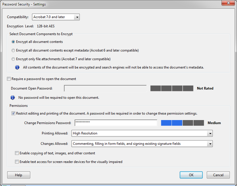
    Many PDF creation and editing programs allow document creators to apply security settings to a PDF file. These settings include file opening and editing restrictions, plus search engine attributes.

    Access restrictions on a PDF file means encryption, which requires a password. We’re going to set a password, then customize the permissions available to users and search engines.

    For this example I’m using screens from Adobe Acrobat Pro X, but the settings terminology should be similar for most programs.

    First, you need to access the security settings at the time of PDF creation or when you edit it afterward.

    In Adobe Acrobat you can find the settings in Document Properties, under the Security tab:

    Acrobat X Security Tab

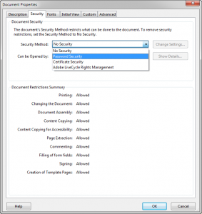
    You’ll need to select password security to set restrictions.

    Acrobat X Password Security

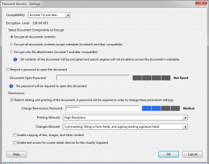
    Then set the options like this:

    • We want to encrypt all document contents to hide the text from search engines.
    • We don’t want to require a password for opening the document, but we do want to set a password to restrict editing the document.
    • We want to allow high resolution printing.
    • We only want to allow readers to comment and fill forms.
    • Do NOT enable copying of text, images or other content.
    • Do NOT enable text access for screen reader devices. This is important for hiding the PDF text from search engines.

    Confirm your security changes and save your PDF.

    That’s it! Upload your PDF and set your robots.txt file.

    What about PDF Content NOT Used for Lead Generation?

    If you have PDF that you provide to your visitors without requiring a lead gen form, then you should still consider hiding the PDF files from search engines.

    Why?

    First, the duplicate content penalty. Second, you want visitors to have the full experience of your website. That won’t happen if they access the PDF files directly from a search engine.

    Of course you don’t want to hide the fact that you have this PDF from the search engines, but do it right. Describe the content of the PDF on the page that features the download link. Make sure you describe what’s in the PDF and the benefits of downloading it.

    Do you agree with my reasons for hiding PDF content? Any suggestions for doing it better? Please share your thoughts below.

  • How to Recover from a “Marketing Malfunction”

    How to Recover from a “Marketing Malfunction”

    On October 31, I blogged about how one marketer dropped an f-bomb on his mailing list and paid the price with lost subscribers and customers.

    It was more of a “what not to do” post.

    Now I’d like to explore how you can recover from a blunder like this, the marketing equivalent of a “wardrobe malfunction.”

    More cynical people might assume spin doctoring is in order, but the simplest solution usually requires little more than eating a jumbo slice of humble pie. Be honest with your subscribers and customers and admit you screwed up.

    Let’s take a look again at our WordPress consultant’s marketing malfunction, when he dropped the f-bomb in an email subject line, not once, but twice.

    Subject: BYOB Live – How to Fix a WordPress Website that is Totally F**ked Up!

    Karl — Yes, I know that the f-bomb is entirely inappropriate for professional communication. But sometimes a site gets so messed up that polite language simply can’t capture the agony of owning it. Sometimes something happens that screws up a site so much that it makes you despair for your humanity. One of our members has such a site.

    In my previous post I discussed how his blunder cost him customers and subscribers, but let’s explore how he should have responded.

    First, he should have apologized immediately on the same day or no later than the next. This wouldn’t bring back the people who had already unsubscribed, but it might have given him a chance to make good with those on the fence. Maybe even recovered a few paying customers.

    Here’s one possibility for an apology email:

     Subject: BYOB Live – I am So Sorry!

    Karl – I owe you an apology for my earlier email. It was entirely inappropriate and I’m sorry if I offended you.

    I wanted to get your attention for what I truly believe is a critical issue for WordPress site owners. But I went too far. I promise it won’t happen again.

    I still would like you to attend this important webinar and I assure you that I will conduct this webinar in a professional manner with family-friendly language.

    Again, you have my sincerest apology. Here are the details for your webinar:

    The goal is to keep it simple—a sincere apology followed by a renewed invitation for the free webinar.

    Of course, he could have quietly taken his lumps and pretended it never happened. That’s what many businesses do, but I don’t recommend it—especially if you received a number of complaints.

    Yes, it’s damage control (not a bad thing if you’re sincere), but it’s also important for maintaining the relationship between your business and your customers/prospects. As an inbound marketer, your greatest asset is your relationship with your customers and prospects. It’s your job to repair any damage you do.

    Most businesses typically face problems other than profanity in their marketing communications. It’s often a technical glitch or a problem related to order processing, quality control, or customer service. But your response should be the same: Acknowledge your blunder and offer to make good on the problem.

    If it wasn’t your fault (like a major storm delayed product deliveries), then tell your customers that you understand their anger, concern, or inconvenience and are sorry they had to experience it. Acknowledging your customers’ pain or frustration goes a long way toward solving the prolem. Sometimes, people just want to know that they’ve been heard. And always be sincere in your response, not patronizing.

    But, if the screw up truly is yours, then respond according to the severity and your customers’ reactions. Always fix the problem. Then, if you feel that fixing the problem isn’t enough, offer them something of value, like a discount, an extension to a subscription, or a gift. Sure, it’s a bribe, but it’s also a good investment in retaining your customers.

    What stories do you have about marketing blunders and their resolution? Please share them below.

  • How to Lose Clients and Alienate Your Readership

    How to Lose Clients and Alienate Your Readership

    I was preparing this morning for my weekly webinar with the LinkedIn Inbound Networkers Group, where our topic was “Marketing Dos and Don’ts.” I remembered a doozy of a marketing “don’t” from two months ago: A pair of emails sent by a WordPress consultant to his email list. This consultant ran a paid membership site offering WordPress video tutorials, custom plugins and help forums.

    Back in August, when the first of these had emails arrived, I was absolutely stunned by the author’s idiocy. I was going to say “cluelessness,” but “idiocy” is the only word that truly conveys his colossal blunder.

    Here is the first email subject line and opening paragraph (asterisks are mine, not his):

    Subject: BYOB Live – How to Fix a WordPress Website that is Totally F**ked Up!

    Karl — Yes, I know that the f-bomb is entirely inappropriate for professional communication. But sometimes a site gets so messed up that polite language simply can’t capture the agony of owning it. Sometimes something happens that screws up a site so much that it makes you despair for your humanity. One of our members has such a site.

    Now, I’m not prudish and I sometimes use similar language among people who aren’t offended by it. I even worked on a project back in 1994 that resulted in some very profane and funny conversations with a client. That project was The Historical Dictionary of American Slang, Vol. 1: A-G and the client was Random House. Huge project that took most of a year to complete.

    The high-pressure New York City publishing world is infamous for salty language, but the conversations we had with the client during the course of producing this book were priceless. Here’s a snippet of a typical conversation that my wife, my employees or I would have had with the client:

    Client: Go to “f**k your buddy week.”

    Me: Let me open the last “F” file. OK, “f**kwad,” “f**k-you lizard”—here we go, “f**k your buddy week.”

    Client: We need hyphens between the words “f**k your buddy” for the entry and in some of the citations, including “f**ck your friend week” and “f**k your buddy night.”

    And we went on in the same vein. At first, it was hard to resist the desire to giggle a bit at these absurd conversations. But, by the end of the eleven-month-long project, we’d become immune to the power of the f-bomb and other cuss words.

    Thirteen oversized pages of tiny dictionary type were devoted exclusively to variations of the f-bomb in this enormous tome that documented more than 300 years of American slang. I think the f-bomb had the dubious honor of claiming more pages than any other slang term in Volume One.

    My point of this odd segue? There is a time and place that’s appropriate for certain language. I can even think of a few markets where you might need an f-bomb or similar language for authenticity.

    But not for a general business audience.

    Twenty days later I received a follow-up email from this consultant (again, the asterisks are mine):

    Subject: BYOB Live – How to Fix a F**ked WordPress Website Redux!

    Karl — Yes, I know that the f-bomb is entirely inappropriate for professional communication. Hey the last time I sent this out a bunch of people quit! – But that’s how bad it can be sometimes. So bad that the last time I tried this EVERYTHING went wrong. Tomorrow we’re going to take another crack at it.

    He obviously didn’t learn anything! In this email he admits that “a bunch of people quit” after he sent his first email. I assume he lost subscribers to his email list AND paid members of his website. And then he does the same thing again!

    Like I said earlier—idiocy.

    And he paid the price for it with the loss of subscribers and customers. All for a little sensationalism.

    So, is there ever a good reason to shock your audience?

    Sure. Grabbing attention with a provocative email subject line or headline is nothing new. In fact, it’s often critical to cut through the clutter.

    But ALWAYS consider your audience and your credibility with them.

    When I moved from Pennsylvania to Texas, I suffered a bit of culture shock. People back in the northeast tend to throw around mild profanity casually; whereas, people in Texas avoid it. Even a common explicative like “damn it” is often rephrased as “darn it” or even “dag-nab-it.” I’m not kidding! I’ve even heard people refer to “hell” as “H-E-double hockey sticks.”

    So imagine the response you’d get dropping an f-bomb on someone uncomfortable saying “damn it” or “hell.”

    And you’d better believe that our WordPress consultant had such people on his mailing list and as customers. Emphasis on HAD. I’m sure many of them have departed.

    In case you’re wondering, his general tone and language in previous emails was always inoffensive and Rated G—about what you’d expect from someone writing to a general business audience. That made his f-bomb even more shocking because it completely deviated from the persona he’d established in his communications.

    Have you ever received—or used—similar emails or marketing messages that crossed the line? What about ones that shocked but were effective? Please share!

  • Selecting a WordPress Theme for Inbound Marketing

    Selecting a WordPress Theme for Inbound Marketing

    With the re-launch of the Etika Marketing website under a new design, I thought it only appropriate for the inaugural blog post to discuss WordPress theme selection. The theme I’m using for this site is called Good Bones, by Make Design, Not War (MDNW on Themeforest) and available from Themeforest. (9/10/14 update: The Good Bones theme has been pulled from sale at Themeforest after many promises from the developer to update it. A perfect example of why you need to consider developer support of a complex theme or theme framework. Themeforest is not at fault; they are merely the marketplace. I suggest avoiding any themes by Make Design, Not War. I’m now shopping for a new theme for this website.)

    I’m a big fan of using WordPress as a CMS (content management system) for inbound marketing websites. I enjoy the design flexibility, the ease of expanding capabilities through plugins, and its search engine friendliness.

    Clients appreciate the ease of adding content via a familiar WYSIWYG interface. I like to tell newcomers to WordPress that adding a blog post is as easy as editing a document in Microsoft Word. And they don’t need to deal with the technology to perform routine tasks.

    Another huge plus for WordPress sites is the availability of thousands of themes, which allow you to alter your website design with only a few clicks.

    Well… maybe.

    A (Very) Short History of WordPress Themes

    As WordPress has evolved, so have themes. In the old days you had a fairly straightforward collection of templates and CSS (cascading style sheet) files and a limited number of configuration options. It was rather easy to recognize WordPress-driven websites without peeking at the source code.

    If you wanted to modify your theme beyond the out-of-the-box configuration, you needed to delve into CSS and PHP coding to make those changes—and pray the next release of WordPress didn’t break those customizations.

    Then themes like Thesis appeared, giving the more tech-savvy among us the ability to control many design features via dashboard controls. More complicated CSS and PHP customizations were managed via customization files. This made the theme more stable and less likely to break during both theme and WordPress updates.

    Along with Thesis (and later, Genesis) came the rise of “super themes,” called “frameworks.” Frameworks are base themes that allow for much more sophisticated customizations that could be saved as “skins.”

    Not long after, WordPress introduced “child theme” capabilities. Child themes allow users to customize a theme without changing the original or “parent theme’s” files. A child theme is a set of customized CSS files, templates, function files, and images stored in a separate directory. Only the customized files are stored in the child theme’s directory. WordPress will automatically use the parent theme files if a required file is not presentin the child theme.

    When a developer releases a new version of a theme, only the parent theme’s files are updated. Customized child theme files usually need to be updated manually.

    In addition to themes based on frameworks and others based on parent-child relationships, we have hybrid themes that use both.

    What’s Needed in a Theme?

    So what does all this have to do with selecting a WordPress theme for your inbound marketing site?

    Be patient, I’m getting there.

    Today’s WordPress themes can range from simple “old school” themes to hybrid monstrosities with frameworks, child themes, skins, additional settings files, and even special plugins.

    So what’s the best theme for you?

    In the old days you would either pick a theme whose design appealed to you or you would contract with a web designer to create a custom theme for you.

    For now, let’s forget about custom theme development and focus on how to pick an off-the-shelf theme.

    As an inbound marketer, you should have the following elements available in the theme or through third-party plugins:

    • Ability to create landing pages free of distracting elements like sidebars and navigation.
    • Flexibility to customize your sidebars (third-party plugins like Custom Sidebars can provide this capability if your theme doesn’t).
    • Responsive design, where the layout automatically adjusts for the screen size or device type, like desktops, laptops, tablets and smart phones. Third-party plugins can handle some functionality for mobile devices, but it’s far better to have a responsive design built into your theme.
    • Ability to easily add boxes to your pages and blog posts for calls to action. This can also be handled through third-party plugins, like Call to Action.
    • Flexible page layouts, like multiple columns and boxed content, which are easy to create and modify. This allows for more modern and dynamic page layouts.

    How to Shop for a Theme

    Here’s how I shop for a theme:

    • Find several themes that have designs that appeal to me or my client. I usually ask clients to provide several examples of websites they like, then I review those sites with the clients to establish the design elements they want and need.
    • Check to see which themes support my “must have” design elements, like responsive layouts for mobile devices, flexible page design via widgets or customizable boxes, sliders, tables, etc. I also view the theme documentation, if available, to get an idea how the theme works from the inside. Some themes require extensive CSS experience for customizing, while others don’t.
    • Look for active developer support. I want to see recent theme updates–at least within the last six months. And the developer must maintain a community support forum. That’s an absolute for me. A support ticket system is also appreciated. Some themes have a flat license fee with lifetime upgrades and support, while others require periodic license or support subscriptions.
    • Read customer reviews about the theme. Start with the negative reviews first to expose any fundamental problems. Then move to the support forum and view the common user complaints and questions. Not every developer will offer refunds, so do your homework, especially if the theme is expensive.
    • Lastly, buy the theme and test it on a development WordPress installation. You won’t know if a theme is right for you until you try it. You might have to sacrifice the cost of a theme to test it, unless the developer offers a good refund policy. How much you are willing to sacrifice is up to you.

    Regardless of the theme you buy, expect to invest several hours to learn how your theme works and even more time to tweak and adjust your site to your liking. How much time you spend and how much frustration you experience depends on how wisely you pick your new theme.

    The plus side of picking a smartly-designed and well-supported theme is the time you will save after you’ve covered the initial (unavoidable) learning curve. Changes and updates should go much more smoothly—your site will look great—and it will meet your needs as an inbound marketer.