Tag: responsive design

  • Simple Fixes To Make Your Content Mobile Friendly

    Simple Fixes To Make Your Content Mobile Friendly

    In my previous two blog posts about mobile-friendly content, I wrote about what I feel is missing from most of the marketing content delivered to mobile devices.

    I mentioned technologies that I believed are coming in the near future or are only available now from a small handful of providers (usually at a rather high cost, too).

    So where does that leave you, right now? What can you do to improve the effectiveness of your communications on mobile devices, especially smartphones and smaller tablets?

    First, let’s get the tech solutions out of the way.

    Enhance Your WordPress Site’s Mobile Capabilities with Plugins

    If you’re using WordPress you can take advantage of plugins that will automatically swap out graphics and other content based on the device being used to view your content. I’d love to offer a list of suggested plugins and I even started making that list, but ultimately scrapped it.

    Why? Because, as I began vetting the WordPress plugins in my list, I noticed a high degree of volatility in support and updates. Plugins popular a year ago were now all but abandoned. New plugins with tempting feature lists were still in alpha or beta release. This area of plugin development is in its infancy and changing very rapidly.

    My suggestion? Do a web search with keywords like wordpress plugin, mobile, responsive, content, graphics. You can also perform a similar search within WordPress.org for plugins, where you can also see a plugin’s update status and user reviews. And always check the support forum of a particular plugin to see how well it’s supported and if it’s working for most users.

    Some features to look for:

    • Images optimized by size. Instead of downloading the full-sized image and resizing it on the fly to fit a device, the plugin would manage different sizes of images and download only the one best suited for a device’s screen size. This improves page load speed.
    • Alternate CSS loading. Plugin detects the device and loads a different stylesheet for certain page elements to present a better viewing experience.
    • Content optimized by device. Plugin gives you the option to serve content for a specific device type by using shortcodes to bracket that content. For example, replacing a detailed image or photo with a simpler one. More advanced uses would allow you to replace longer passages of text with shorter ones for smartphone users.
    • Mobile-enhanced menus. The plugin would allow you to create custom menus that are easier to use on mobile devices (particularly smartphones).
    • Mobile-friendly forms. You’ll probably need a plugin specifically for contact and subscriber acquisition, so don’t expect to find this feature bundled into a plugin that includes any of the above features.

    Consider Mobile When Writing Your Content

    Sometimes the simplest solutions are best.

    Technology-driven solutions might be cool and impressive—when they’re working—but in a rapidly-evolving area like mobile-responsive, they are prone to breaking and incompatibility.

    So go back to your writing basics:

    • Keep your written content lively, interesting and as short as reasonably possible.
    • Use shorter sentences and much shorter paragraphs.
    • Use frequent short and relevant headings to help readers skim and navigate your articles and posts.
    • Use bulleted lists (just like this one!)
    • For email, make your subject lines short and provocative. Include a call to action, like “Open Now” or “Details Inside.” Keep the body copy short and sweet. Includes links back to your website for more detailed info. (a little story on this below)

    All of the above tips will also help your desktop readers, who happen to be adapting their desktop reading habits to match their mobile ones.

    I have a story from a good friend of mine, Mike Young, about how smartphone users respond differently to email.

    Recently, Mike was telling to me how he tends to scan email subject lines on his smartphone much the same way he does text messages. If the subject line appears to contain the bulk of the sender’s message, he moves on, never opening the message.

    But the tables turned on him when he sent an email to his customers announcing an product update. Mike’s product, Website Legal Forms Generator, is web-based software that creates legal disclaimer and policy documents for websites. His email bore the subject line, “Announcing new Website Legal Forms Generator documents,” and discussed recent changes and updates to the forms produced by the software. Of course, the email went on to say that you could simply log into your account and retrieve the updated forms.

    To Mike’s surprise, he received a number of support calls from customers asking how they could get the updated forms. It was obvious they’d never opened the email he sent or read the entire message inside.

    After a few of these support calls came in within hours after sending the email, he starting asking these customers if they’d read his email. Most replied that they saw only the subject line or scanned the first part of the message. The instructions about logging in to retrieve the updated documents were near the bottom of the message.

    My first fix for this problem was to change the subject line:

    • “Open Now For Your New Legal Forms”
    • “New Legal Forms Added — Details Inside”

    I also suggested simplifying the email body copy and starting with a sentence like:

    “I just uploaded 5 new forms to Website Legal Forms Generator. Log into your account now to access them.”

    Then provide a short summary of those five forms in the email copy.

    Anticipate Mobile Limitations

    The other big tip you can use now is to anticipate potential mobile limitations and offer simple alternatives in your content.

    For example, if you include a video in your content, offer a link below that video so mobile users have the chance to view your video in a corresponding app (like YouTube or Vimeo), in case the video won’t play properly from the web page.

    For graphics, consider loading a thumbnail in the copy, but link to the full-sized image.

    Of course, you’ll need to test your own web pages on mobile devices to identify these potential problems.

     Big Changes Coming Soon

    Undoubtedly, we’ll witness enormous and rapid change over the next several years as mobile becomes the dominant platform for online access.

    Your challenge as a marketer is to master this new technology as it becomes available (and affordable) and study the evolving behavior of mobile users. Most importantly, look to your own analytics for insight on how mobile users respond to your website and your online campaigns, then adjust your marketing efforts accordingly.

    I see some exciting (and scary) times ahead.

    And please share your experiences in the comments below. Theory is great, but real world experience is invaluable.

  • Do Mobile Users Require Different Content?

    Do Mobile Users Require Different Content?

    My previous post discussed the need for website and email design better suited for viewing on mobile devices–as anyone who has tried to view a non-mobile-optimized website on a smartphone understands.

    Responsive design is one of the easiest ways to adjust a website’s layout and fonts to fit the size of the screen being viewed. Likewise, many email marketing platforms now offer responsive design capabilities and templates.

    But is this enough? Or do we need to consider how mobile users consume content while on their devices?

    Speaking for myself, my browsing habits while parked in front of my 24″ flatscreen monitor are far more leisurely than when I’m hunting up a product review on my smartphone in a crowded store.

    Unless I’m surfing my phone to kill time (while waiting in the airport for a flight, for example), I prefer to get to the information I want quickly and with as little futzing around as possible.

    The Shopping Experience on Mobile Versus Desktop

    Amazon is a good example of what I’m talking about.

    On the desktop, your basic Amazon product page is packed with content. Some relates to the product being viewed, like descriptions and reviews, while much of it is tied to related products, promotions, and account info.

    Amazon Desktop and Mobile Product Page

    But view the same product on your smartphone and the experience is completely different. Gone are all the distractions. Sections of the product listing, like description and features, are truncated, with the option for the shopper to view the full info with a click.

    I see this approach to serving up different versions of content to mobile users becoming quite common as our content publishing platforms grow more sophisticated and methods to accurately identify mobile devices improve. But it’s also going to require more testing and a deeper understanding of how mobile users consume content and respond to calls to action.

    The Landing Page Must Change for Mobile

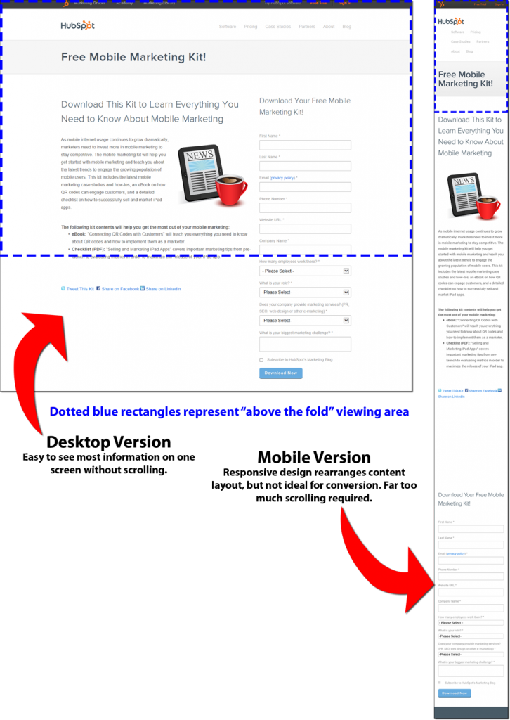
    Perhaps landing pages (also called offer pages) provide the most relevant example for inbound marketers of the need to serve up alternate or optimized mobile content. Building a landing page for a desktop screen is fairly straightforward. You’ve got a headline, a short block of copy, benefit bullet points, a relevant graphic, maybe a short video, and a lead capture form.

    Below, to the left, is a typical landing page on a desktop or laptop screen. To the right is the same page as viewed on a smartphone. The mobile version was created using responsive design technology, but was not optimized specifically for a mobile device.

    Landing/Offer Page on Desktop and Mobile

    Notice how the mobile version requires quite a bit of scrolling and is hard to follow when compared to the desktop version? I don’t have the data, but I would guess that the mobile version also converts poorly against the desktop version.

    This is a good example of a key issue that marketers must grapple with as mobile continues to become the preferred method of accessing online content.

    Customizing Email for Mobile

    Let’s consider email on the desktop and on a mobile device like your smartphone.

    If a subscriber receives your email and opens it on the desktop or laptop PC, they will see not only a layout optimized for a large screen, but they may have longer paragraphs and more of them, plus additional graphics.

    However, if they open the email on a smartphone, the email might contain a different set of text and graphic content, organized in a simpler layout. The text will likely be shorter and written for fast and easy reading on a small screen. Graphics may be different than those in the large-screen version; they will not only be smaller in size, but may be simpler in composition.

    Lots of Change Coming Very Soon

    And that’s only the tip of the iceberg. As marketers, we must learn how prospects behave while using mobile devices versus desktops. We must test, adapt, and test some more. We must push our technology providers to give us the features and capabilities we’ll need to improve our marketing efforts to mobile users.

    I wish I had an easy solution for how to deal with content optimization among desktop and mobile devices, but I don’t. Many of our content delivery platforms have yet to provide the technology to optimize for specific devices. The growth of mobile has been so rapid that it’s caught most of us with our pants down.

    But we’re learning, and I think we’ll see more solutions in 2014.

    If you want to dig deeper into the state of mobile internet access today and how we might adapt our content strategies, then I encourage you to visit Karen McGrane’s blog. Karen is the author of Content Strategy for Mobile, an ebook outlining her thoughts and research on this very subject, with her recommendations about how content management systems can be modified to serve “packaged” content to specific platforms.

    The third and final part of the blog series on mobile will look at some practical solutions you can employ immediately, using readily available tools.

  • Mobile Marketing Is No Longer Optional

    Mobile Marketing Is No Longer Optional

    A few days ago, Movable Ink posted their US Consumer Device Preference Report for Q3 2013,  showing that 61% of email opens occurred on a mobile device like a phone or tablet. That’s more people opening emails on mobile devices than desktops (“desktop” referring to both desktop PCs and laptops.

    And the Pew Research Center reported in September 2013 that 21% of adult cellular device owners do most of their online browsing via a smart phone. You can view the full report here.

    Mobile users require a different viewing and interactive experience than do desktop users. At the very least, they need to be able to view and navigate content easily. The days of being faced with microscopic type, unwieldy layouts and broken navigation are over for businesses that want to stay competitive. Mobile marketing is here for everyone.

    This means a change in how marketers serve up web and email content to their prospects and clients.

    Only a few years ago, being “mobile-friendly” meant having two websites: one built for desktops and one for mobile devices. You might have identified mobile websites by their URLs having an “m.” as a prefix to the regular URL. Browse eBay with your smartphone and you’ll see m.ebay.com for the URL.

    Simpler websites would have their “m.” sites designed and maintained separately from the main site. You could imagine the pain that would be. More sophisticated sites (like eBay) would dynamically generate the mobile version from a database engine.

    But the fun doesn’t stop there. HubSpot has a detailed blog post describing the SEO problems multi-URL sites can have. Recommended reading if you fall into this camp.

    And then came responsive design…

    Responsive Design is a Good Start

    There’s plenty of discussion about responsive design for websites and email in the popular Inbound Marketing channels.

    Responsive design often uses a combination of meta tags and CSS to deliver content in a layout suitable for the device or media being used. Fonts are larger; menus and links are simplified and optimized for touch; complex, multi-column layouts are reduced to single columns; large graphics are replaced with smaller and/or simpler graphics suitable for the screen size being viewed.

    A responsive website should also strive for faster load times on mobile devices. Again, this means optimizing the layout and graphics to reduce bandwidth demands (smaller images and less complex layouts).

    Here’s a recent blog post of mine displayed on a Samsung Galaxy S3 phone, a Nook 8.9″ Android tablet, and a laptop screen:

    Samsung Galaxy S3 screen
    Samsung Galaxy S3 screen
    Nook Etika Screenshot
    Nook HD 8.9″ Android tablet screen
    Laptop PC screen
    Laptop PC screen

    HubSpot has a very handy tool to simulate how your website looks on various mobile devices. It even lets you navigate your website on the simulations. Very cool stuff. You can find it here.

    My WordPress site (the one you’re reading right now) happens to use a responsive theme that relies on CSS for the mobile-friendly features. A “media query” in the HTML header or in the CSS determines the screen size (usually width) of device you’re using to view the site, then sets style parameters or loads an appropriate stylesheet.

    Here’s an example of an HTML header tag to load a special mobile-optimized stylesheet in the event a small screen is detected:

    <link rel="stylesheet" type="text/css" media="only screen and (max-device-width: 500px)" href="small-phone.css" />

    Other WordPress websites might use similar themes and CSS for responsiveness or they might use a combination of theme/CSS and a mobile plugin or just a mobile plugin with a non-responsive theme. There are pros and cons with each of these options.

    And Don’t Forget Email

    But responsive design isn’t limited to websites. In fact, email might be a more critical application of responsive design, especially since the number of people viewing email on mobile devices is rapidly overtaking desktop use. Simple responsive email designs work much like responsive websites do, by changing font sizes and simplifying layouts into single columns. Here’s an example of an email newsletter using a responsive design:

    email example browser
    Email on a desktop browser
    email example mobile
    Email on a phone

    However, some email marketing platforms allow email designers to create completely different emails for mobile users. Chad White, Principal of Marketing Research at ExactTarget and author of the book Email Marketing Rules, writes about how some businesses are making email content mobile-friendly on the Content Marketing Institute’s blog.

    He talks about responsive design, where the layout alters to accommodate smaller mobile screens, but he then gets into “mobile-targeted” design, where elements of the email content are changed to accommodate mobile users. These elements might include mobile-specific offers (“show this coupon to the cashier for an extra 10% off”) and call-to-action buttons (“click to call now”).

    But, before we can create this alternate email content, we must understand how mobile users consume content on their devices. It’s a new dimension to marketing, but one we can’t ignore.

    Next week, in Part 2 of this post, I’m going to explore the possibilities of how marketers might go beyond responsive design. How does “responsive content” sound?