My previous post discussed the need for website and email design better suited for viewing on mobile devices–as anyone who has tried to view a non-mobile-optimized website on a smartphone understands.
Responsive design is one of the easiest ways to adjust a website’s layout and fonts to fit the size of the screen being viewed. Likewise, many email marketing platforms now offer responsive design capabilities and templates.
But is this enough? Or do we need to consider how mobile users consume content while on their devices?
Speaking for myself, my browsing habits while parked in front of my 24″ flatscreen monitor are far more leisurely than when I’m hunting up a product review on my smartphone in a crowded store.
Unless I’m surfing my phone to kill time (while waiting in the airport for a flight, for example), I prefer to get to the information I want quickly and with as little futzing around as possible.
The Shopping Experience on Mobile Versus Desktop
Amazon is a good example of what I’m talking about.
On the desktop, your basic Amazon product page is packed with content. Some relates to the product being viewed, like descriptions and reviews, while much of it is tied to related products, promotions, and account info.
But view the same product on your smartphone and the experience is completely different. Gone are all the distractions. Sections of the product listing, like description and features, are truncated, with the option for the shopper to view the full info with a click.
I see this approach to serving up different versions of content to mobile users becoming quite common as our content publishing platforms grow more sophisticated and methods to accurately identify mobile devices improve. But it’s also going to require more testing and a deeper understanding of how mobile users consume content and respond to calls to action.
The Landing Page Must Change for Mobile
Perhaps landing pages (also called offer pages) provide the most relevant example for inbound marketers of the need to serve up alternate or optimized mobile content. Building a landing page for a desktop screen is fairly straightforward. You’ve got a headline, a short block of copy, benefit bullet points, a relevant graphic, maybe a short video, and a lead capture form.
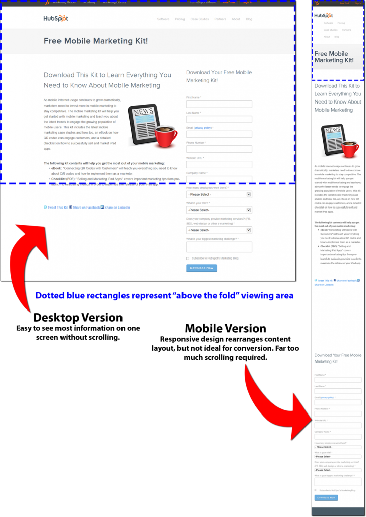
Below, to the left, is a typical landing page on a desktop or laptop screen. To the right is the same page as viewed on a smartphone. The mobile version was created using responsive design technology, but was not optimized specifically for a mobile device.
Notice how the mobile version requires quite a bit of scrolling and is hard to follow when compared to the desktop version? I don’t have the data, but I would guess that the mobile version also converts poorly against the desktop version.
This is a good example of a key issue that marketers must grapple with as mobile continues to become the preferred method of accessing online content.
Customizing Email for Mobile
Let’s consider email on the desktop and on a mobile device like your smartphone.
If a subscriber receives your email and opens it on the desktop or laptop PC, they will see not only a layout optimized for a large screen, but they may have longer paragraphs and more of them, plus additional graphics.
However, if they open the email on a smartphone, the email might contain a different set of text and graphic content, organized in a simpler layout. The text will likely be shorter and written for fast and easy reading on a small screen. Graphics may be different than those in the large-screen version; they will not only be smaller in size, but may be simpler in composition.
Lots of Change Coming Very Soon
And that’s only the tip of the iceberg. As marketers, we must learn how prospects behave while using mobile devices versus desktops. We must test, adapt, and test some more. We must push our technology providers to give us the features and capabilities we’ll need to improve our marketing efforts to mobile users.
I wish I had an easy solution for how to deal with content optimization among desktop and mobile devices, but I don’t. Many of our content delivery platforms have yet to provide the technology to optimize for specific devices. The growth of mobile has been so rapid that it’s caught most of us with our pants down.
But we’re learning, and I think we’ll see more solutions in 2014.
If you want to dig deeper into the state of mobile internet access today and how we might adapt our content strategies, then I encourage you to visit Karen McGrane’s blog. Karen is the author of Content Strategy for Mobile, an ebook outlining her thoughts and research on this very subject, with her recommendations about how content management systems can be modified to serve “packaged” content to specific platforms.


Leave a Reply